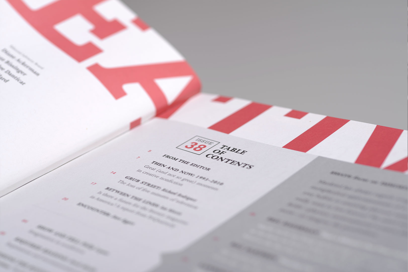
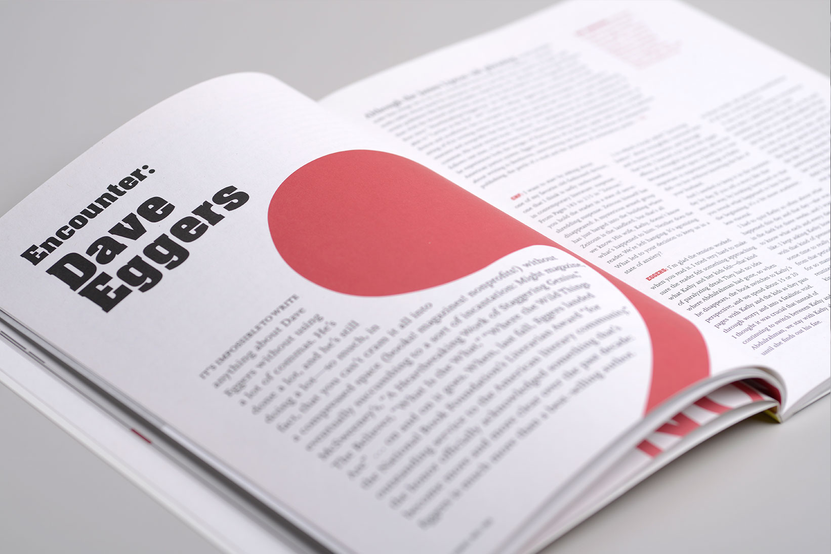
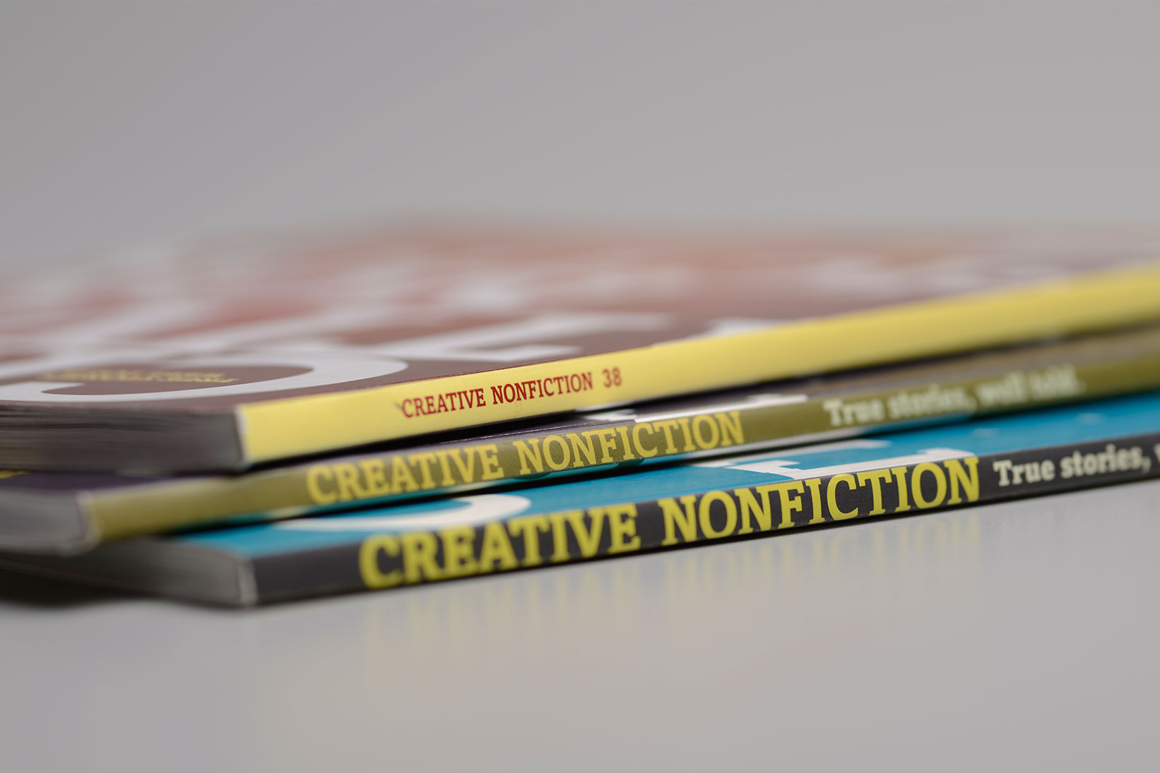
Our collaboration with CNF transformed their 15-year-old literary publication from a journal into a magazine.
And we certainly didn’t take the task lightly. The weighty journal was two-color text cover to cover—and there were no images. We knew that redeveloping the journal into an 88-page magazine wouldn’t be easy.
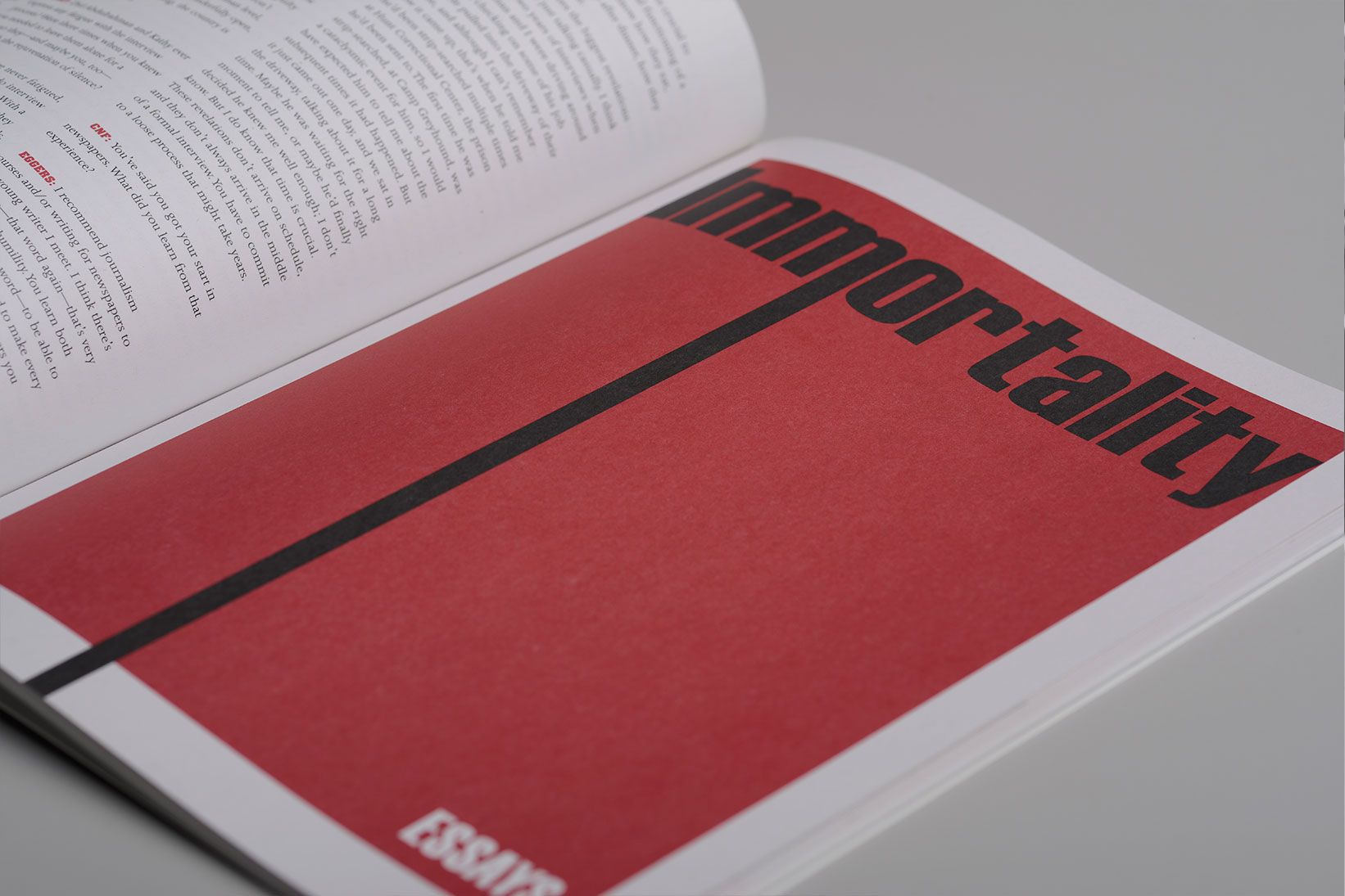
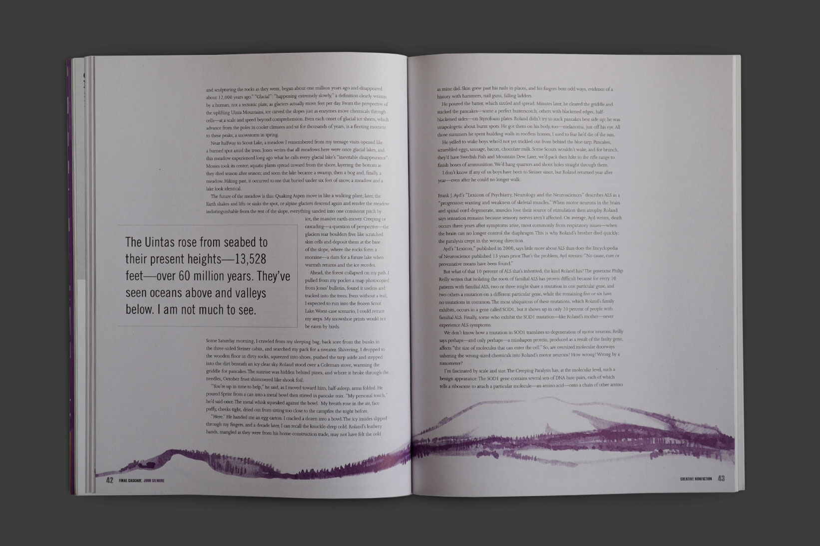
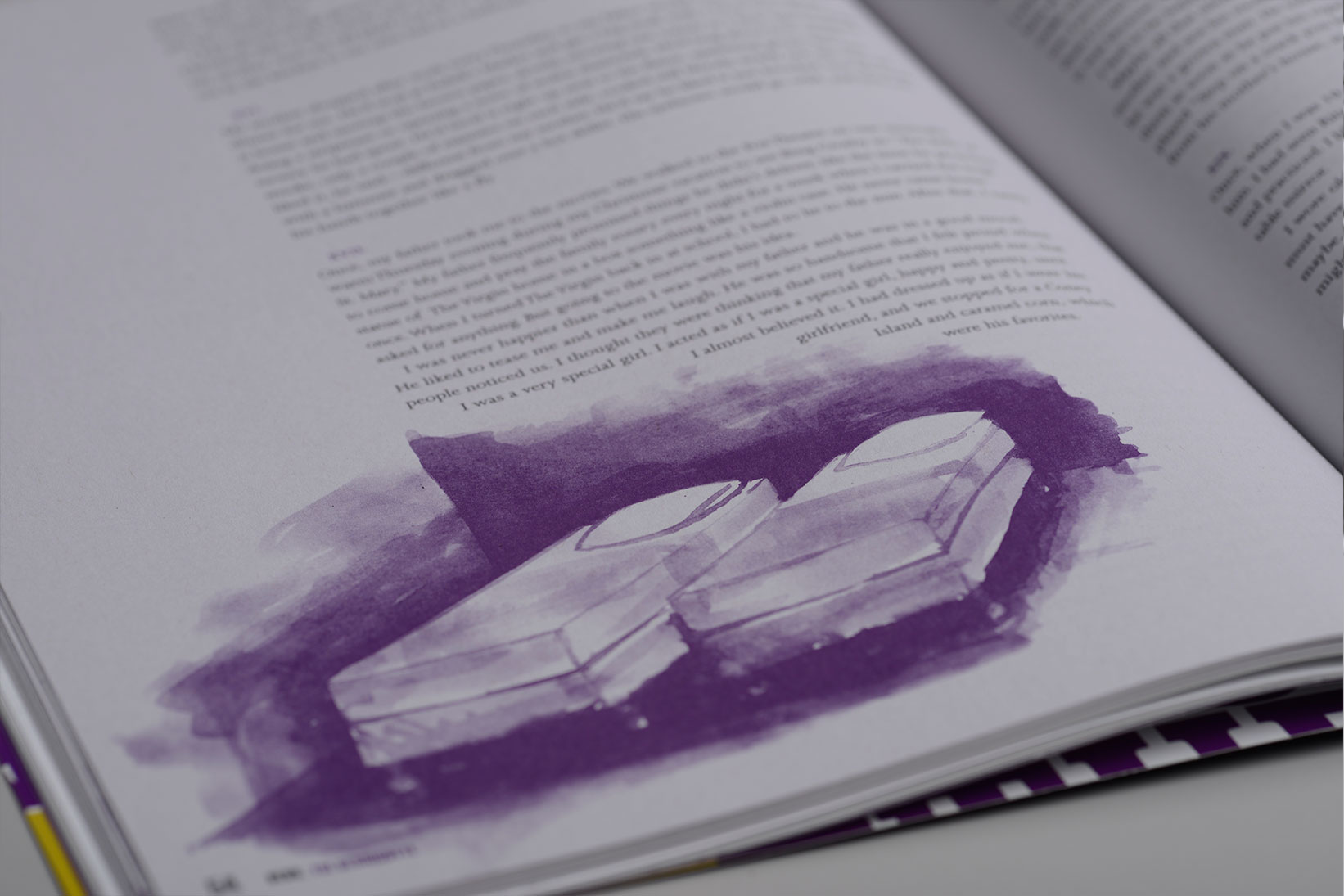
Additionally, CNF commissioned Little Kelpie to create a suite of illustrations for two issues of the new magazine. (For the first issue’s illustrations about immortality we thought so much about death that we felt like we were in a Woody Allen movie.)
Even though CNF wanted a big, bold magazine, they didn’t have money to throw around. To keep costs down, we retained a two-color limitation inside. You’d be surprised how striking just a couple colors can be—you know that phrase, “less is more?” We reviewed paper, binding, and printers to ensure that CNF was putting its limited printing funds into its best use.
Then, before our eyes, a leader in the genre became the best looking magazine on the creative nonfiction block while doubling their subscribers after the release of the first redesigned issue.
